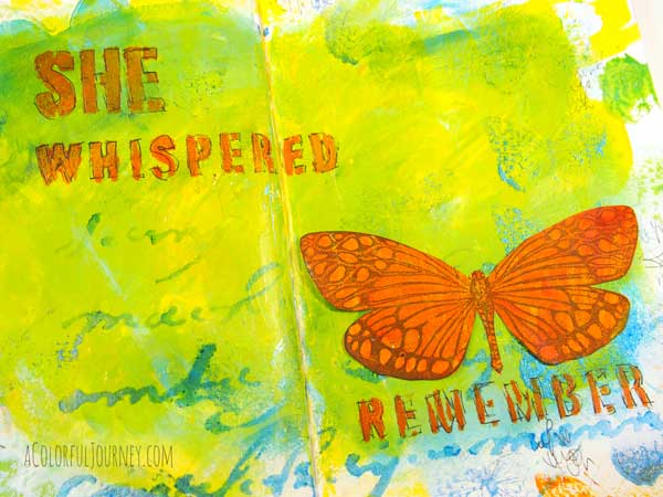

 Downton Abbey has me under its spell. I have avoided it until recently and now am an addict devouring seasons as quickly as life will allow. While listening to the video of Downton Funk- okay, watching the video while pretending to straighten up the studio- I ended up with an art journal page instead of a clean studio. So I called it a good day!
http://youtu.be/IO7t7fRk4IU?t=3s
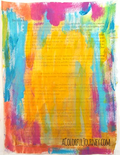
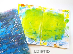
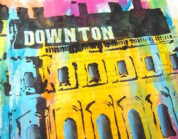
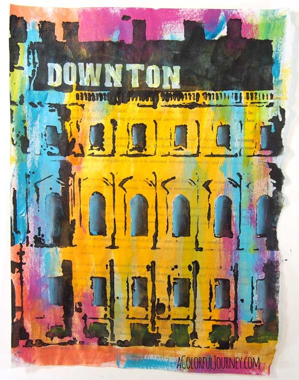
Leftover paint on my brushes led to this…couldn’t bear to waste a drop of paint. I know, Downton Abbey tends to have more muted colors but the characters are oh so colorful.
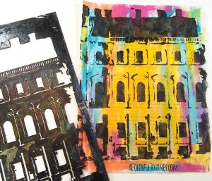
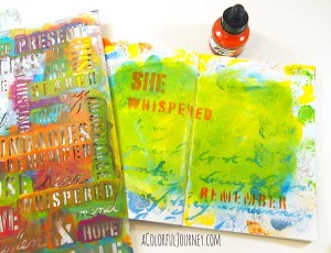
My 1700’s Building stencil jumped out at me as a manor so I let my imagination run wild that it was Downton Abbey.
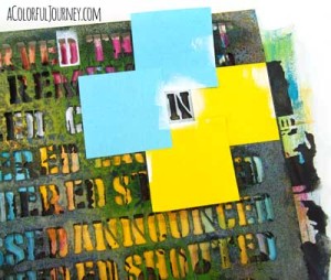
I did not have a stencil that said Downton so I used letters from other words on my Verbage stencil to create what I needed. Just some little Post it Notes for some quick masking.
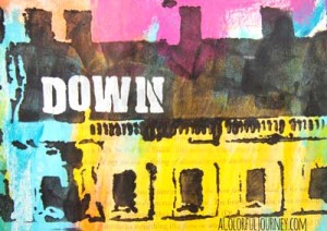
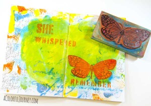
What would Carson say! My letters weren’t perfectly spaced. I always chuckle when I see him with the ruler measuring the spacing of place settings.
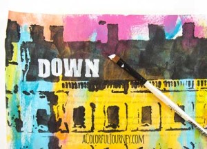
I covered up the stencil breaks with a little touch of white paint…had to keep things prim and proper in honor of Mrs. Hughes…
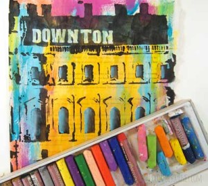
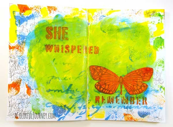
But I can’t keep things too proper…there had to be even more color. Oil pastels added bits of color here and there with some messy smudges.
Supplies Used
- 1700’s stencil
- Verbage stencil
- oil pastels
- acrylic paint