I am so thankful for challenges- well art challenges that is…I have been working on an upcoming workshop and my brain became a bit fried doing all the non-art behind the scenes work. I was feeling stuck and every decision felt like a life altering decision. The Summer of Color rescued me! How? I’ll show you!
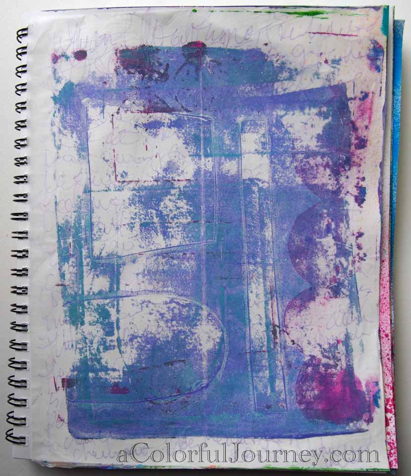
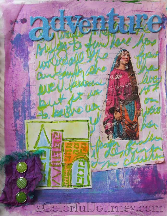
This week’s colors are purple and green so that was one decision made! I had a mission as I searched through my art journals which led to me finding this background made from Gelli printed deli paper from who knows when- felt right as soon as I saw it.
 I was on a roll making decisions! This paper I experimented on called to me so I knew it had to go into my art journal. Another decision made! I’ve been playing around with Lesley Riley’s TAP
 ![]()
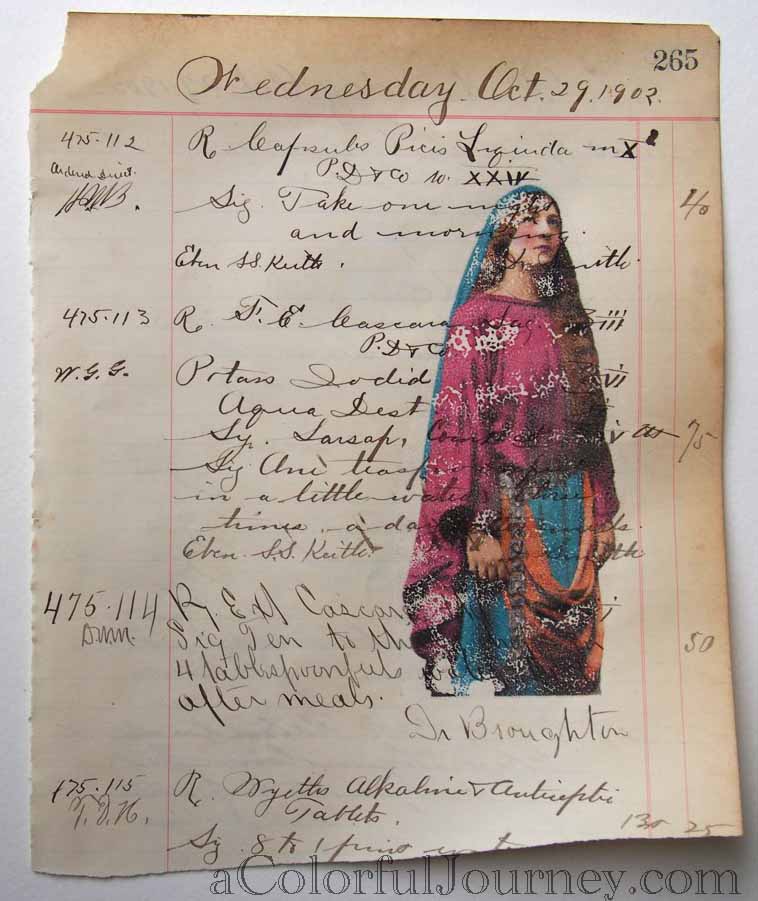
(Transfer Artist Paper) and digital images from HiddenVintageStudio’s La Vie Boheme.
Always loved the look of transfers but I never had the patience. TAP to my rescue! It quickly and easily gave me the imperfect (it could have been perfect but I wanted imperfect- shocker)! I even have a giveaway coming next week related to TAP- so be sure to stop back on July 3rd and check it out.
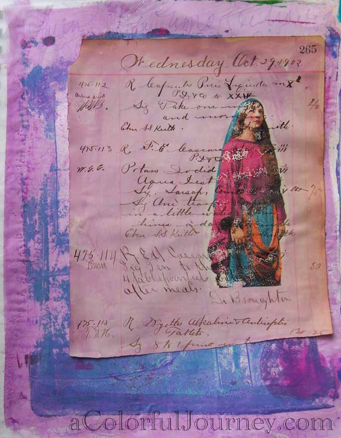
I glued her down and used some very watered down purple paint to tint the paper. Since there was extra I darkened up the background too. Why waste the paint!

Before I realized it I was back to normal and able to easily make artistic decisions.
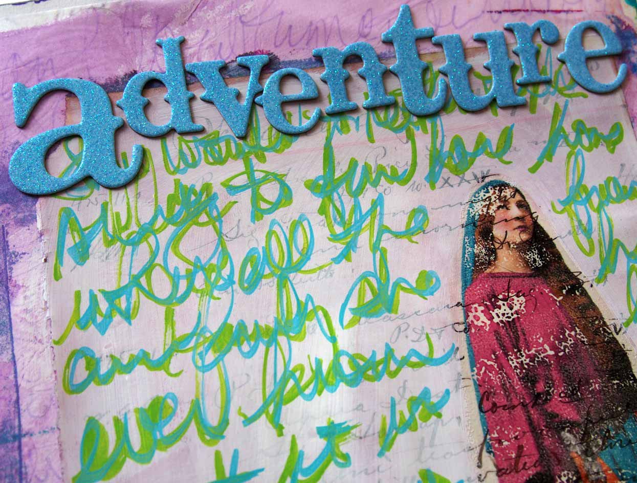
Her story had to be added to the page but where? A thin layer of gesso let the words underneath peek out but to fight with the words I will add on top.
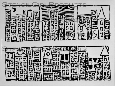
As I thought about her story, how she left her home unexpectedly , Jamie Fingal’s City Stencil at StencilGirl came to mind. The buildings in this stencil remind me of cities in Europe- they felt like her home.
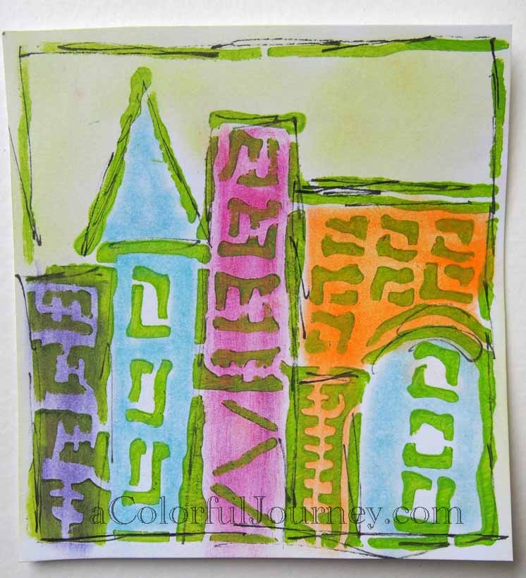
I almost got stuck trying to decide on what color to use with the stencil when the challenge saved me- I needed green!
I didn’t want to use the whole stencil, so I didn’t! I just picked one part that spoke the loudest to me. A quick swipe of PanPastels and suddenly I had color.
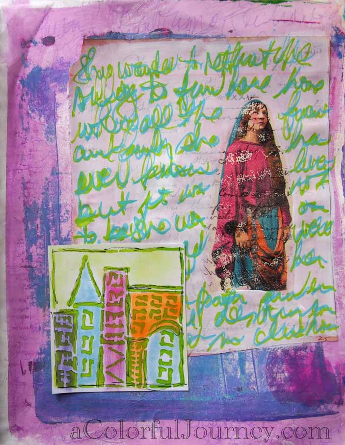
Using 2 of the new Liquitex paint markers I wrote her story. Turns out I am not a natural story teller. Going to have practice that skill! It really isn’t a coherent story which worked out for my sloppy scribble writing but the colors were wonderfully opaque with paint the flowed easily.
But she needed more for me to be happy. This page sat for a while until an idea popped into my head. She needed a title and a touch more purple and green. I used up brads and letters I had been hoarding! Bonus!
Thank you to all the hosts of challenge blogs out there who help keep me from getting stuck!
Want more creativity? Check out The Summer of Color, Paint Party Friday, Art Journal Every Day, Through the Craft Room (anything goes) and Creative Every Day.

Nice! I love that lady! I am about to embark on the same summer of color challenge too… I love that color combo. I totally think the brads and letters weighted down those sides of your page. Gotta love it when the intuition starts rolling!
Awesome!! Looks like you had fun!!
Lovely page!
Xo
I love all the layering you did in this piece. Blessings!
I love the colors in this piece!
Turned out awesome! Exhilarating piece, sumptuous color! <3
This page is so whimsical and happy! I love the brads and the darker purple, makes the eye go all over the page ♥
Great page, you used the inspiration well! Valerie
Congrats on being the featured artist at PPF this week! I really struggled with the purple and green combo, but you did an amazing job (as always).
Rinda
Looks a fun page. Love the colour combination.
Carolyn, this is amazing!!!. LOVE everything, the gelli print, the gorgeous lady, the colors and yes, I do LOVE your handwriting … I need to practice mine :).
What an incredible journey you had to get to where you are with this piece. Love it.Happy PPF to you.
interestng process! HPPF! xo L.
Gorgeous! !You pushed through and it healed you and produced something beautiful!! Win/win!! High five!!
Hugs Giggles
awesome post. Love that lady and how you’ve created an adventure for her and in the process, took one yourself. xo
What a page! Thanks for sharing the process. I love your result and I think your writing is perfect.
That is so cool!! Love the journey to the finished page!!
Terrific page for SOC, Happy PPF, Annette x
Forgot to say I love all the layering, x
Fantastic demo as always, great use of a myriad of things to create such a wonderful piece….Love that swipe of the pan pastels over the stencil, hmmm, might have to play with mine over the weekend….thanks for the inspiration. Happy PPF xox
This is a great “adventure” I love that your post took us step by step. Wonderful finished piece.
Beautiful! Love the HVS image you used and the vintage paper. HPPF!
Carolyn, first, congrats on being the artist of the week. I knew whose it was the minute I saw the example! Your post today is very enlightening as well as being a beautiful piece of art. I had forgotten about transfers. I have some wonderful Sheer Heaven paper that works with alcohol to make transfers. I love the stuff and found that I could wipe off the old image with alcohol and reuse it. I’m going to go dig out my papers again and try your wonderful technique.
Fantastic page. The composition is great. I love the lime green text and the bit of cityscape. It’s all wonderful!
I like your story of progression. It seems like we can be stuck but if we just try different things then something will come out eventually and our creative juices get flowing again. This journal page is very cool in all areas. It is great to have all the challenges from the blogs to use. It keeps me arting as well 🙂
What an adventure! I love challenges, too, and they can often get me out of a rut or out of my comfort zone. I love your journal page today! Sweet brads for grounding everything!
I LOVE image transfers, Carolyn. This came out awesome!
Thanks so much for the walk through your creative process. It turned out great.
Wonderful, creative take on the SoC challenge and this weeks colour combination:)
very nice page
Your writing and the composition of this piece make my heart sing. Hard to believe you weren’t feeling the flow at the beginning. I’m glad you stuck with it.
Love your page. The picture transfer is beautiful. I also find that those challenges keep you from getting stuck!
xx
Love purple and green and am enjoying your website!
Oh, Carolyn… so many awesome details here! Loving the blue/green tandem writing and the lady herself. Fabulous page!!
I was excited to see you on the SOC list. I love your journal piece. I had a tough time with these paticular colors. I ended up with mud most of the time. I love to do print transfers, but haven’t heard of TAP. I’ll definitely have to check that out. I am not always patient either. Probably why I ended up with mud most of the time this week. I also started following you on bloglovin’. I just transferred from google reader to bloglovin’. I really like bloglovin’s feed. Well hope to see you again next week. (((HUGS)))
Kim
SOC#68
I love the page and even more so the story that goes along with the creation!
Loved your process and reading it. I stenciled piece at the bottom is a perfect touch. Lots of different textures that totally keep my eyes moving–LOVE it!
The layers look fantastic and the artwork is so very creative !!
fabulous work 🙂
Your gal and her story are perfect for SOC. Very impressive. And of course, you allowed your layers to dry, thus giving you lots of bright, intense colors. Love this one.
Great purple and green page for SOC!! Always enjoy seeing how you create your pages!
Such a creative and wonderful page! I love how you used this week’s colors! Simply amazing!
This is fabulous. I love hearing about your process, and especially watching you use up gelli prints. I have a bit of a collection developing from my gelatin plate printing. Gorgeous use of the colours. I struggled with them, but that is what I loved about the challenge. Extending myself out of my comfort zone.
Wonderful page! Your transfer is lovely…I like the non-perfect-ness of it. And what I wouldn’t give for some of your lovely vintage paper with so much writing on it! I think my favorite touch on the whole page is the silk at the bottom left…it is unexpected but works beautifully. Nice work! Peace to your heart, Sara
Hi Carolyn: What an intriguing and mystical piece of art you have created. Thank you so much for showing your process. I love that about your blog posts! It is quite wild how you arrived at the end and how brave of you to cover up what began in order to continue to your final beautiful piece. Oh gosh, we are so brave to cover the first and second and third beautiful layers aren’t we!!! lol The image transfer is perfect Carolyn! I just love it and you have integrated ALL your pieces so beautifully. It is really a stellar composition! Lovies, Samara
I love the overlays. . . the collage of it. Blessings, Janet PPF
Thank you for thelovely tutorial and inspiration.