
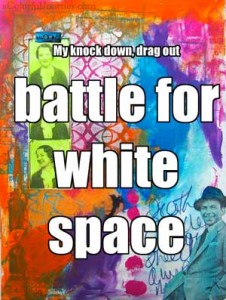
My battle for white space continues. I love the look of white space but color is my addiction. This was a knock down drag out fight between color and white space.
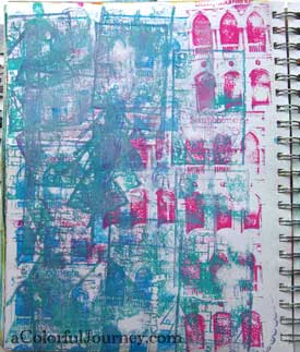
Round One Goes to Color
It isn’t glamorous but it is a place loaded with color to start! This absolute mess, which I love by the way, was made while using rubber stamps on the Gelli Plate.
Brelow is a video I made showing you how to use rubber stamps on the Gelli Plate. I might have even made the messy first layer in this video…
Watch Rubber Stamps and the Gelli Plate on YouTube.
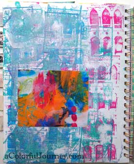
Round Two Goes to Color
I slapped one of my Spark of Art-spirations from my free newsletter that I had printed from who knows when. It really doesn’t match in any way…but more color is always good.
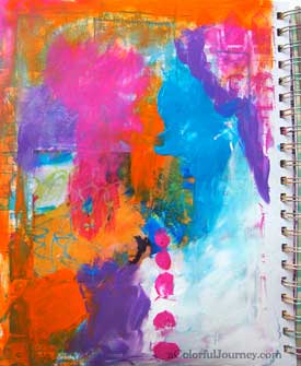
Round Three Sees White Space Fight Back
Started playing with the paints. It felt so relaxing to smear paint and get my hands into it. Those pink dots are courtesy of a finger that just had to get messy.
It looked like color was going to give the knock out punch to white space until white paint demanded some space on the page.
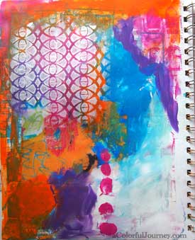
Round Four Goes to White Space
It’s not exactly white space, but the white used the color to make it stand out and pop more than any other part of the page by stenciling Eye Lattice.
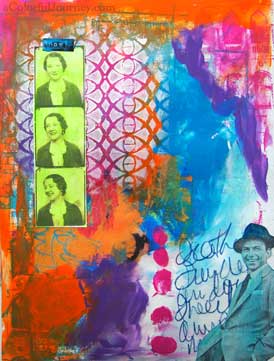
Round Five Goes to Color
That pop of white brought color in swinging! Colorized photos and a rubber stamped image gave the knock out blow to white space. Then to add another jab, the journaling right over the last area of pure white space.
Colors Wins
The fight was over. Color had won this time but white space put up a good fight. White space will be back for a rematch!

White space put up a good fight. I feel your pain. I have a lot of trouble with the same issue. 🙂
Love your videos. Thanks for the inspiration. You make me smile
What Vicki says & you fight the good fight and I thank you for it – no matter how small the white space can make a big difference despite our urges to add just a little more colour
I am so glad color wins because I love this page……of course, color is kind of my thing too. Ah…..xox
Smashing colors, Carolyn. The music reminded me of a James Bond theme.
I always enjoy your videos Carolyn. As for white space, I’d love to see more…it would make your colours even more brilliant.
Carolyn, I can’t imagine your works with more white, you are such a colorful person, so let it float!
LOVE YOUR WRITTINGS, you make me laugh so much but not only that I have to say I always learning something new, thank you so much for sharing with us. Love your videos and look forward to those so much.
What is in your coffee girlfriend?!!! hahaha! Great post and I’m am very pleased with the reigning champ!
I am very white, and also very spacy, so I love this!
REALLY COOL idea! LOVE Sinatra, too = )
Hi Carolyn, I especially enjoyed the rubber stamps you used on this video. I will be going to Venice, so wondered what company makes these wonderful stamps? Thanks so much, Leslie G.
Have a great trip! That stamp is from Stampington.
LOL! The one design rule which I have the most trouble with is “Learn to love white space.”
Rinda
Glad to know I am not the only one! I love the look of white space but just seem to love color more…