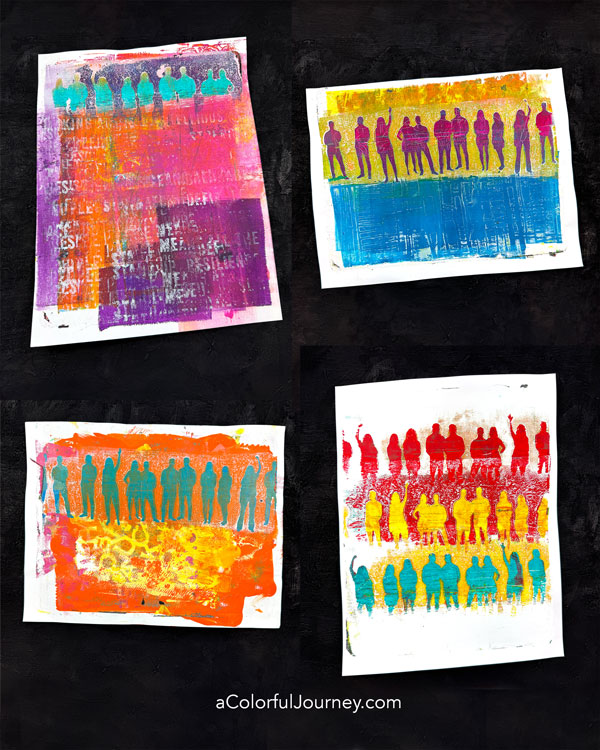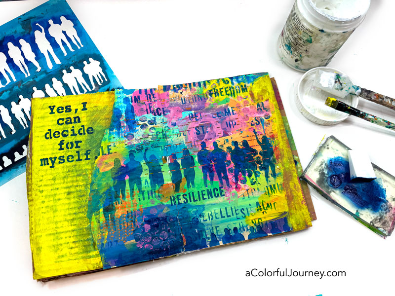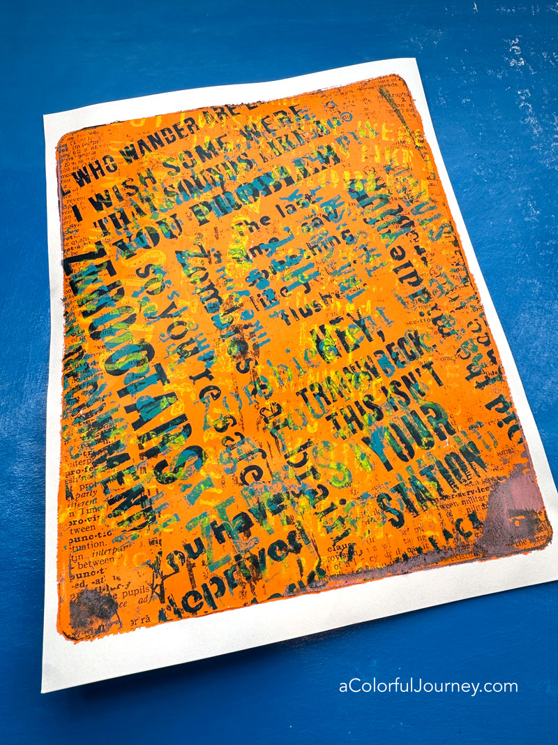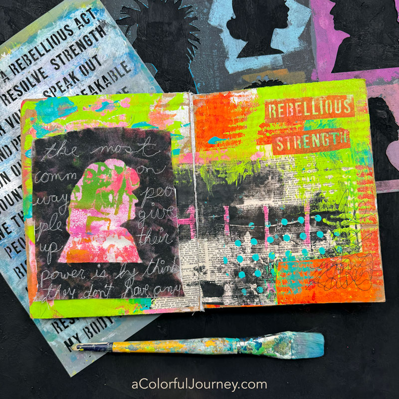

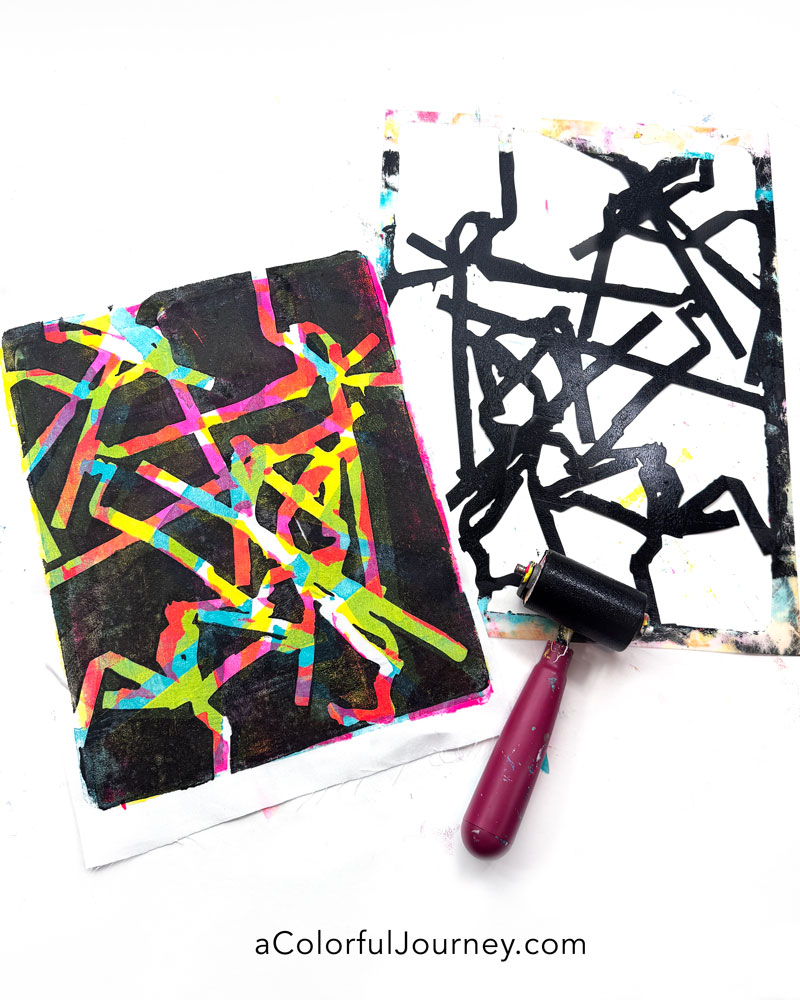
What starts as a simple layer of paint can turn into a wild adventure. I set out to do a little gel printing with stencils—just for some playful experimentation—and by the third layer, I was completely smitten. But it was the fourth layer, with that black paint that just shifted everything!
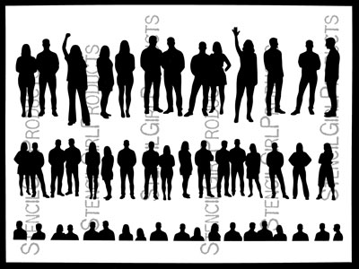
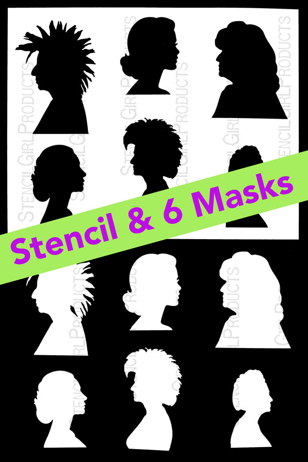
The stencils I used are by e bond, and I have to say, her vibe is infectious. You can find her Crimp, Crinkle, and Crease stencils at StencilGirlProducts.com, and they’ve quickly become favorites for adding layers to my prints.
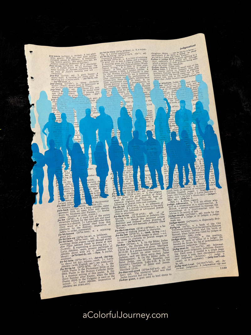
Will this technique work on paper too? You bet! In the video, I share a print that was made using the same technique but on paper. If you’re on Instagram, you can see a reel where I did this exact same process on paper. Whether it’s fabric or paper, the play is wide open.
Did I use regular acrylic paints on fabric? Yes because this piece is destined for an art quilt and won’t be washed. If you want to make fabric prints that will go through the laundry, I recommend fabric paint.
Will the paint make the fabric stiff? After the first layer, just a hint. With each new layer, it stiffened up a little more, but even at the end, it wasn’t too much. My sewing machine breezed right through it (though if you’re hand sewing, a thimble is your friend!).
Do you need a special fabric to gel print? Nope. I love using inexpensive 100% cotton, but honestly, any fabric you have on hand is fair game. Natural fibers soak up the paint beautifully, but blends and other types can surprise you in the best ways. It’s all about experimenting and seeing what you like—no right or wrong, just playful detours.
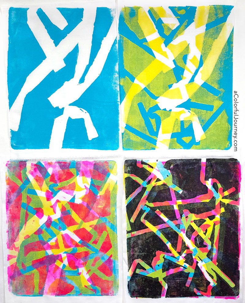
That last layer of black completely changed the direction of the print and adds that touch of mystery. The kind of mystery that makes it very tough for someone to figure out exactly how you did it. But as you saw in the video above, it’s just some simple steps.
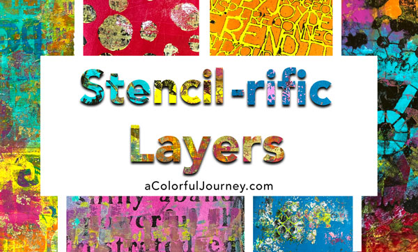
This is just the tip of the iceberg for what you can do with your stencils and gel plate. If you’d like more ways to add that final layer to add more mystery and depth to your prints, check out Stencil-rific Layers. An entire online workshop dedicated solely to stencils and gel printing.
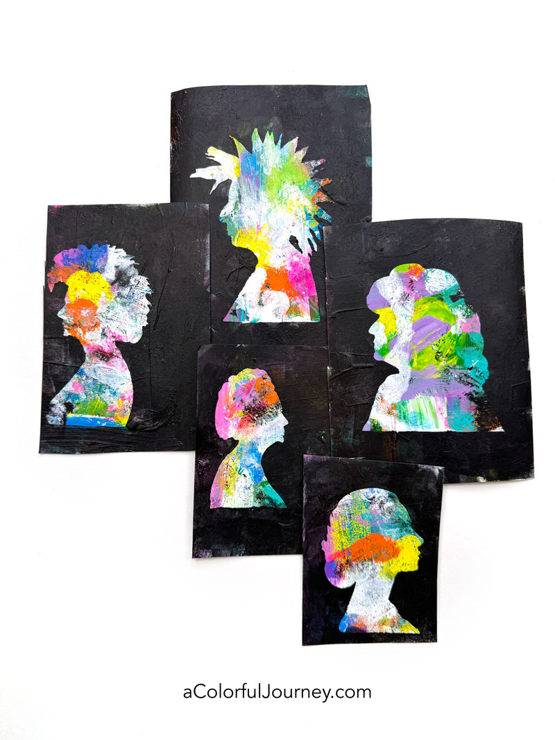
What can you use the fabric for? Whatever you like to create! I’m dipping my toes into art quilting but that’s not the only way you can use it! Art journals, a collage, fabric beads, gosh, anything you like to create you can use gel printed fabric for!
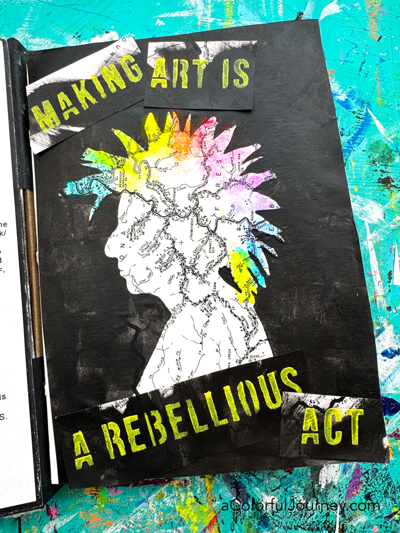
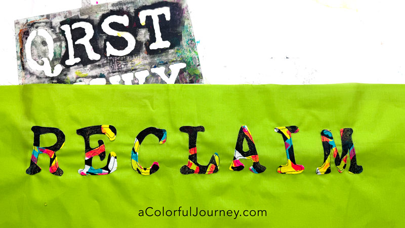
To make it quick (and have the letters be uniform) I used my Jumbo Vintage Typewriter stencils to create a word that has been calling to me this year. What will it all become? No idea and that’s exciting to me- the adventure of it revealing itself!
If you’re new to gel printing, you might have some questions. To help you out, I’ve got an entire page of gel printing resources for you., including the Dos and Don’ts of Gel Printing.
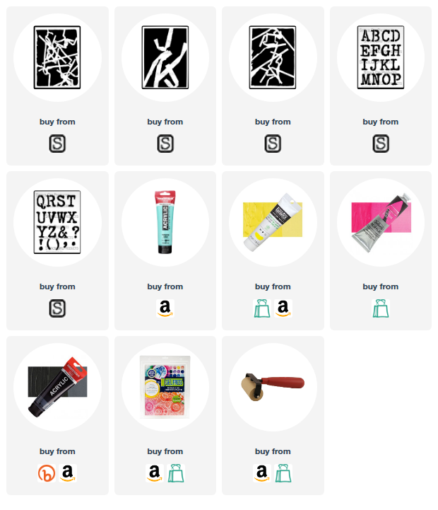
Here are the supplies used. Some of these links may be affiliate links which means I may get a small percentage and it doesn’t cost you anything extra! And you get a really good feeling knowing that you are helping keep the free tutorials coming!
The white fabric I used is a very inexpensive 100% cotton fabric. Nothing special about it at all!