Catching a glimpse of a rainbow in the sky isn’t a daily event here, so when I want to enjoy the rainbow, I create my own on a gel plate! You can use any number of colors, in any order you want, and as a bonus, it’s quick! There’s a trick to this rainbow technique, and that’s to use a small amount of paint. That’s extremely tough for me, but I’ve found a way to do it consistently!
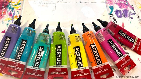
Create thin lines with as many colors as you want in your rainbow. It’s tough for me to use small amounts of paint, so that’s where the nozzles on the caps are so handy. Wondering if they’ll clog? I was skeptical when I started using them, but 6 months later they haven’t clogged.
An unexpected benefit of the nozzles is that they are great for travel. Usually when I pack paint, I wrap the flip cap in packing tape to be sure it won’t come loose during travel. But these nozzles twist closed, so they don’t spill paint as easily as the flip caps. Last time I flew with my paints, I got to skip all the time and hassle of the packing tape thanks to these nozzles!
You can see the details about the nozzles here – it is an affiliate link and it means I may get a small percentage and it costs you nothing to support the blog and keep the free tutorials coming!
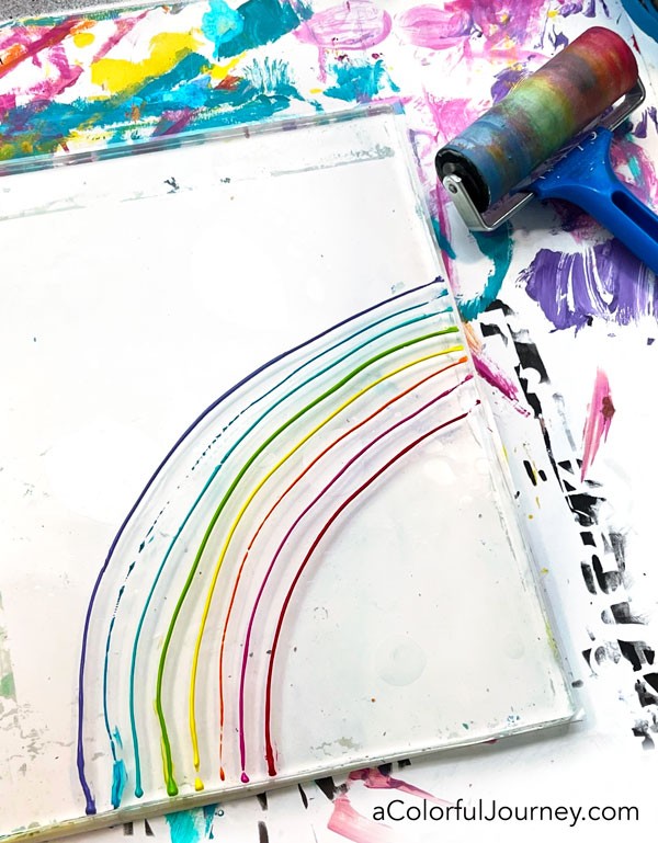
Once you’ve got your thin lines of color on the plate, use your brayer to roll over them. Notice how my lines aren’t perfect. They don’t have to be for this technique.
The 4″ brayer I am using is by Essdee (link at the bottom of the post), and I have to say, this thing is solid, sturdy and a joy to use!
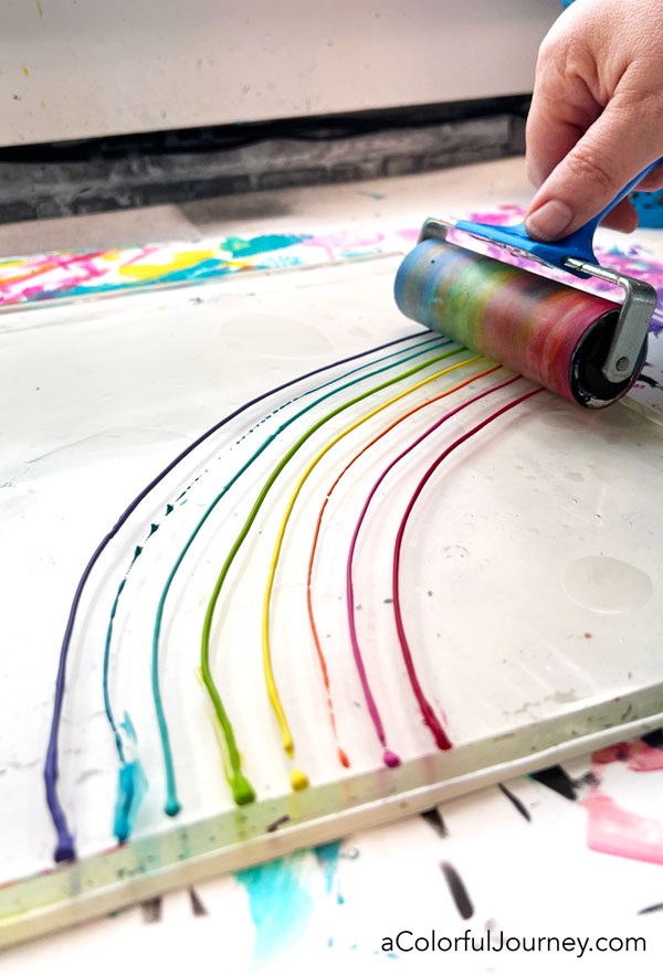
Normally, I roll off the excess paint on a clean up sheet of paper. But not with this technique. I leave that paint on the brayer so I can use it to make more rainbow prints!
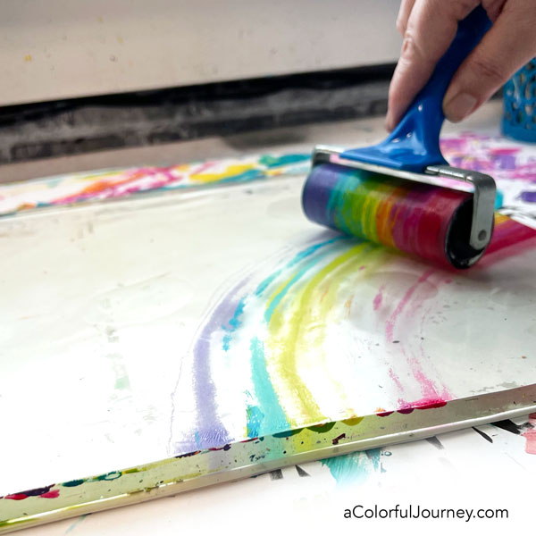
After you take a print or two, take the brayer and roll more paint on your gel plate. Then take another pull. Repeat this process until the paint is all off the brayer!
Rainbows hold a special place in my heart for 2 reasons. First, all those colors together just make me happy. Second, the symbolism of the rainbow. All those bright wonderful colors can mean a lot of different things from hope to promise to peace to luck to new beginnings to eternal life.
But the one that holds the most importance to me is the one for equality. Both of my kids are gay and every time I create a rainbow it’s like throwing the intention of equality into the world for my kids and for everyone in the LGBTQ+ community.
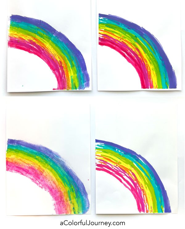
This is just one of the many kinds of prints you can do with a gel plate, you see more ideas and everything you need to know to get started on my page of gel printing resources.
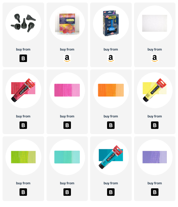
Here are the supplies used. Some of these links may be affiliate links which means I get a small percentage and it doesn’t cost you anything extra! It doesn’t cost you anything extra and you get a really good feeling knowing that you are helping keep the free tutorials coming!

Black is too harsh, white is meh, how about a neutral gray?
I was about to say “black” until I read the comment from Mary in IL. Her neutral gray suggestion sounds like the perfect solution!
You said the nozzles don’t leak and they haven’t clogged. Is there something which closes them from the air?
Great questions Janet. They twist open and closed, so it’s a cap/lid but it has the little tip.
The black makes it pop more. The white just fades out.
Do you have a light sky-blue you could try? Rainbows are at home in the blue sky.
Thanks for the tip and demo of the paint nozzles. I will be trying some of those!
Blues are a great idea- thanks Vicctoria!
White doesn’t do anything; black is ok; but I would opt for a deep purple similar to the one in the rainbow.
Oh purple is a pretty color Judy!
SINCE MY FAV COLOR IS BLUE, I WOULD PICK BLUE, OR HOLD UP SAMPLE COLORS FROM THE RAINBOW AND DECIDE WHICH ONE. OR TO MAKE IT EVEN MORE CONFUSING, HOW ABOUT 2 DIFFERENT BACKGROUND COLORS! LIVE IT UP!
Like the advice to live on the edge Cheryl!
I think you should cut the mats vertically in half, then put on half of each on two rainbow halfs (assuming you gel plated the rainbows other half (facing left)). Now put them side by side, you’ll have the whole rainbow, both with black and white mats, non symmetrical, because let’s face it, if we’re going for true equality here, there should never be a “black, or white? ” choice. They’re equal 🙂
Always game to ditch symmetry Elizabeth!
Black, definitely. Makes the colors pop!
Black!! It makes the rainbow stand out.
Thanks Altie!
I don’t like either mat. They both cut the rainbow off. If you mounted these onto a wood panel you would imagine the rainbow going off into space.
That’s a great idea- thanks!
They are both nice, I would just see which one looks better where you you are going to hang it. And if all else fails, do both and switch them out seasonally? No reason you can’t have it all….lol.
Giving it as a gift, so maybe I will give them both mats and they can swap it out seasonally Ginger!
If it is between black and white, definitely black. Honestly, I would audition a couple of other choices just to see, like charcoal, navy, and a blue-grey.
I wrote a long comment, pushed send, and it looks like it’s lost. It didn’t publish here. At least I can’t see it. Anyway, my Suggestion was to cut the black and the white mats vertically in half and use half of each mat on both rainbow prints (provided you made a second rainbow print going the other direction) and then you’ll have a whole rainbow, each one with black-and-white mat but not symmetrical.. I mean, are we going for equality here, Because if we are, how can you choose between black-and-white, they’re equal. 🙂
Those computer elves must have been on a coffee break Elizabeth! Great idea to ditch the symmetry!
Use the white matte board and make small rainbows around the frame using the gel plate, or the colours of the rainbow in another design.
Thanks for the suggestion Joanne!
👍 I really enjoyed your tutorial on making rainbows. Like you, I think both mat colors look great. However for the first couple of prints I like the black one & then for the later ones in which the colors are a bit softer & lighter the white looks best.
Glad you enjoyed it Jo!
I have to go with neither, the black is too harsh and the white disappears. I would say a gray, with gray it would kind of be like clouds and the rainbow coming out giving hope. (better yet ORANGE, just kidding I wanted you to know it was me!)
Didn’t read the name until Orange, and thought it might be you Linda!
Carolyn,
I think you should paint the white mat blue for your rainbow framing!
🥰
I think I prefer the black border. The white one is also attractive though.
Great little tool — thanks, Carolyn! At the risk of being the oddball, the white was my favorite. It lets the rainbow stand on its own as a statement unbound. It seemed open and free, light, and hopeful — just as life should be for everyone no matter their orientation.
Re your rainbow problem, I think the prints look better with the black frame.