Welcome! I’m Carolyn Dube – This colorful journey is all about the freedom of play!
Search My Blog
Search by Category
The Fine Print
Some of the links on this blog are affiliate links and I receive a small percentage. It doesn't cost you anything extra and helps keep all the free tutorials and videos coming! It's a win-win!
The website is copyright Carolyn Dube, and that is kinda common sense since this is my site.
As an Amazon Associate I earn from qualifying purchases.
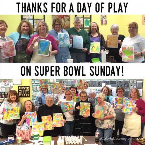
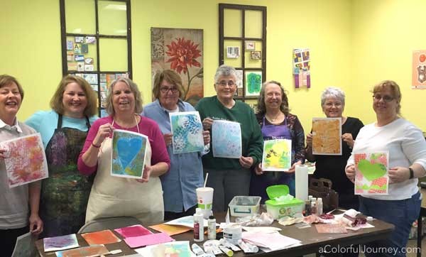
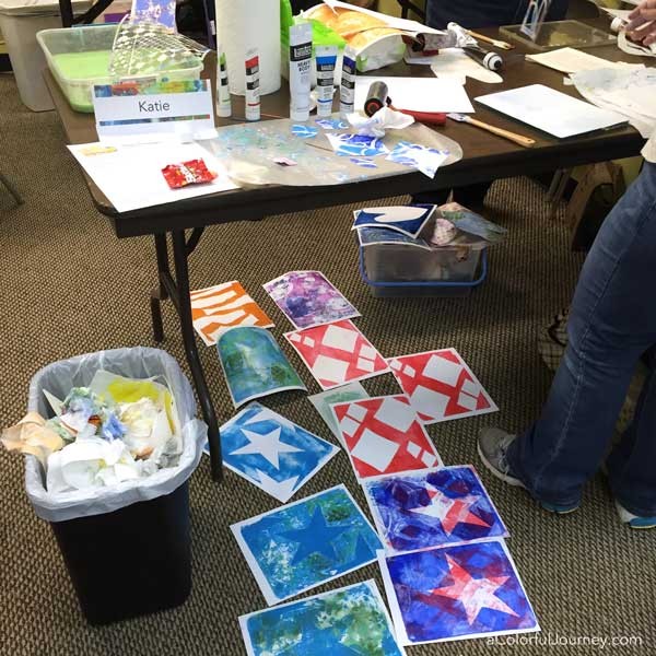
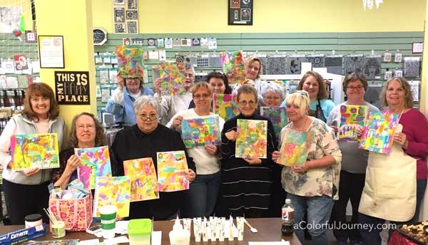
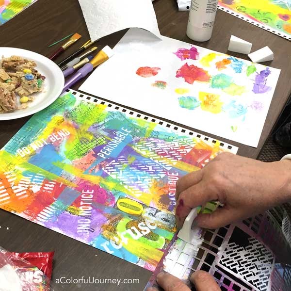
It’s Super Bowl Sunday and that means art play with 2 sold out workshops today at Simply Said Rubber Stamps. With all the excitement…my hands were moving faster than my aging phone so sadly many photos were blurry…but I did get a few!
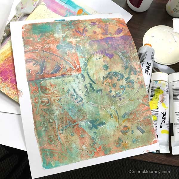
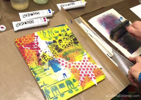
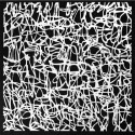
A morning full of Gelli printing® and StencilGirl stencils….these ladies were so much fun and made amazing prints. The prints were overflowing and filling all the open spaces. Even the clean up and brayer pages were eye candy!
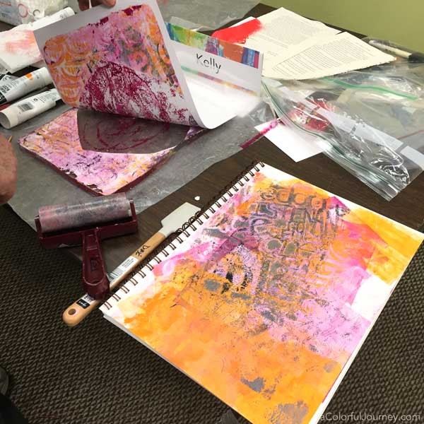
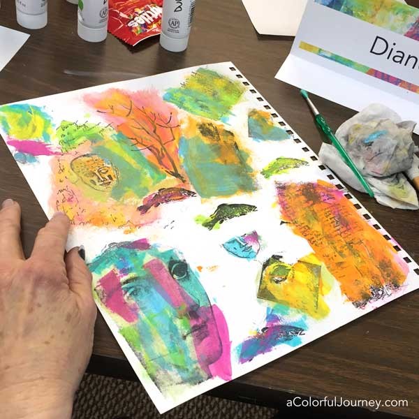
It was an afternoon of Sneaky Art Journaling. These playful ladies built up layers of rainbow fun on their pages. It was truly amazing watching the layers develop as they explored heavy body paints and glazing medium.
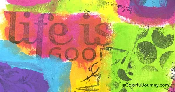
This snippet of a page…Life is Good…summed up a happy day! Thanks Joan for hosting with a tasty Super Bowl spread and being the official group photo taker! And thank you to everyone for sharing your Sunday with me!
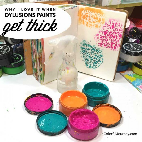
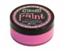
The colors I use most often of the Dylusions paints have become thicker right in the jar. We can talk about all the possible reasons the water evaporates but the biggest one is I leave the lids off for extended periods of time. I’m working on getting better about it…but if I never get better about it…my life will still feel complete.
Some of the water evaporating turned out to be an OOPS…an Outstanding Opportunity Presenting Suddenly. I love the creamy feel of the paint when it is brand new but I like it thicker even more! Why? Because it makes my life much easier.
Thicker paint is easier to stencil with if you are in a hurry or just impatient like me. I can get crisp lines on highly detailed stencils without having to be careful. That’s a big plus to me!
With those wide mouth jars, it is easy to reach in with a cosmetic sponge or brush and use up every last drop of paint so not a drop of pigment gets wasted like in the more traditional skinny tubes and jars.
It is just water evaporating so that means if I don’t want it quite as thick, all I need to do is add water. Even that is easy with the Dylusions. All I do is hit it with a few squirts of water and screw on the lid when I am done to replace any water that has evaporated. I don’t even bother to mix it in because magically by the next day it is all absorbed.
Thanks Dyan for creating such a fun paint that works for all sorts of artful play!
Here are the supplies I used. Some of these links are affiliate links which means I get a small percentage. It doesn’t cost you anything extra and you are helping me keep this blog and my videos ad free! Thank you- I don’t like ads any more than you do!
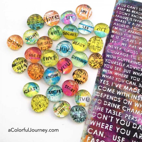
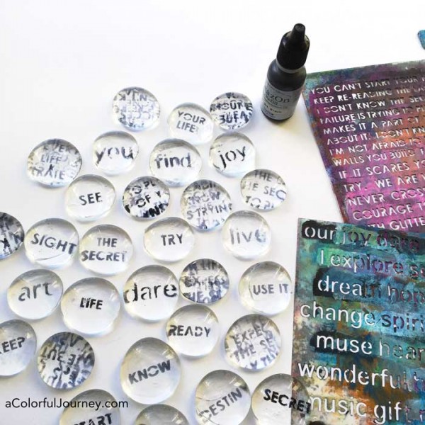
Have any art supplies that haven’t been used in a while? I definitely do! I’ve bought things, enjoyed them, and then somehow they just end up in the bottom of a drawer for a very long time. But not today! I’m going to use one them, glass floral marbles which have been collecting dust in a drawer for almost 10 years!
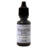
In the video, I’m sharing how I used tape to become my third hand, how easy it is to use Staz On reinkers for stenciling, and how to easily fix any stenciling Oopsies.
Wonder how I created all those colorful gel printed papers I used with the marbles? By gel printing them and you can find out more about gel printing here.
Here are the supplies I used. Some of these links are affiliate links which means I get a small percentage. It doesn’t cost you anything extra and you are helping me keep this blog and my videos ad free! Thank you- I don’t like ads any more than you do!
This website uses cookies to improve your experience while you navigate through the website. Out of these cookies, the cookies that are categorized as necessary are stored on your browser as they are essential for the working of basic functionalities of the website. We also use third-party cookies that help us analyze and understand how you use this website. These cookies will be stored in your browser only with your consent. You also have the option to opt-out of these cookies. But opting out of some of these cookies may have an effect on your browsing experience.
Necessary cookies are absolutely essential for the website to function properly. This category only includes cookies that ensures basic functionalities and security features of the website. These cookies do not store any personal information.
Any cookies that may not be particularly necessary for the website to function and is used specifically to collect user personal data via analytics, ads, other embedded contents are termed as non-necessary cookies. It is mandatory to procure user consent prior to running these cookies on your website.