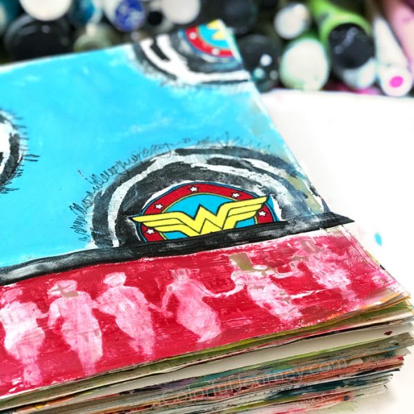
Ever have a day where you don’t want to think? When every decision feels hard?That was today for me. I just wanted to play in my art journal with zero pressure to make decisions. No hunting for things, no looking for the “right” something. Just play. So that meant using whatever was within arms reach.
I found it interesting that the very first decision I made on this page became so important in the end. What was that first step? Adding a layer of white over some gold stenciling. Gold isn’t a go to color for me, so I thought it would just be a layer under some white paint.
Why the scraps of Wonder Woman fabric? They were on the counter so on the page they went. Anything in arms reach is fair game on days like this. No looking for exactly what was needed, because that would involve too many decisions.
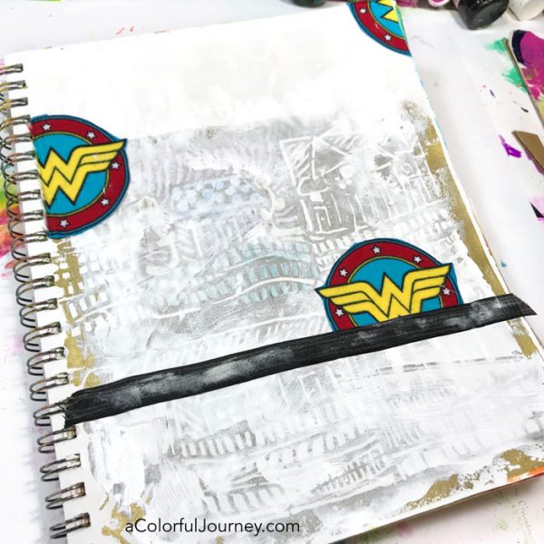
FYI…if the paint is still very wet when you add the gel medium to glue things down, sometimes the paint gets where you didn’t plan. O.O.P.S…and then you realize, that bit of paint on the ribbon is super cool.
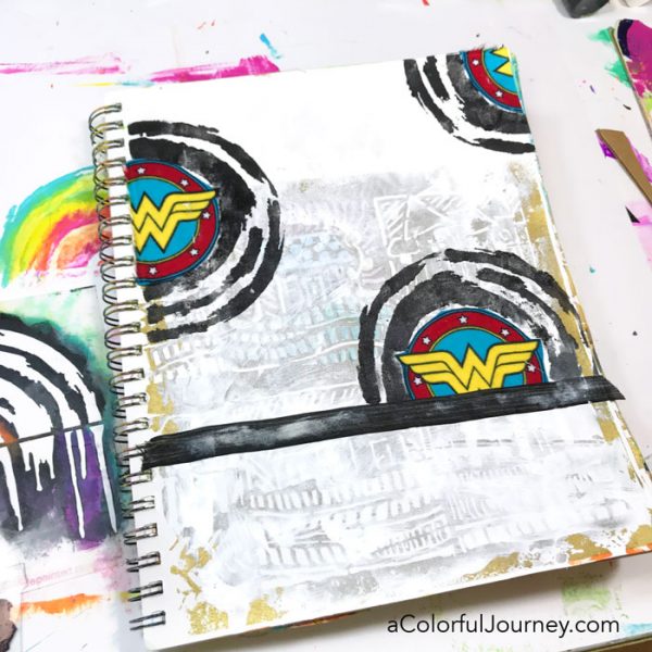
Those circles of fabric needed something more. This blog post began with not wanting to make decisions and by this point in the play, decisions were actually easy. Why? Because that is what play does, it makes things no pressure.
The stencil that was left out from my last project, Little Painted Rainbows, made the Wonder Woman fabric circles more substantial. There is a reason that messy counters can mean more fun!
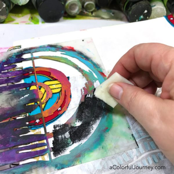
When I designed this stencil, I never ever expected myself to use black with it. I’m usually a colorful rainbow type of person. But in black, it created just what I needed to fill out the page.
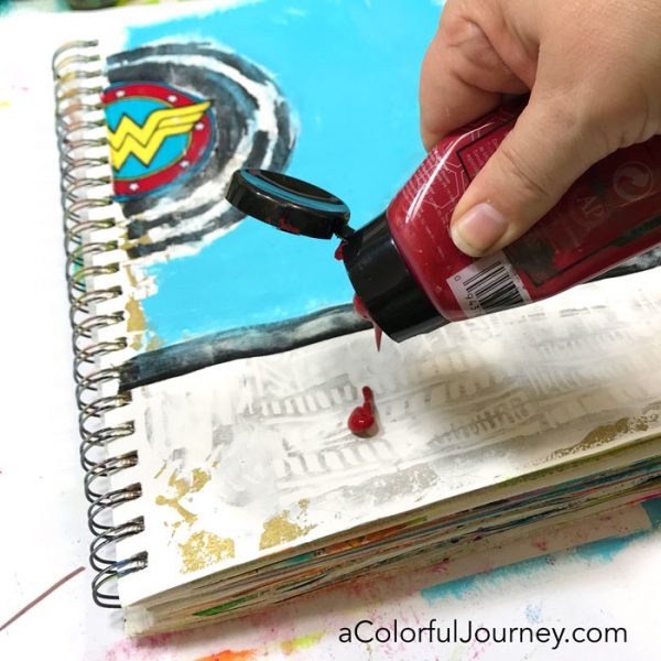
Of all the colors I expected to be working with…red was not one of them. For years, I rarely use red, but I have been using it enough that maybe I have to admit I am starting to like it.
I just said that I was embracing red, but that was a lot of red for me…so I needed to tone it down. I’m not that ready for red yet.
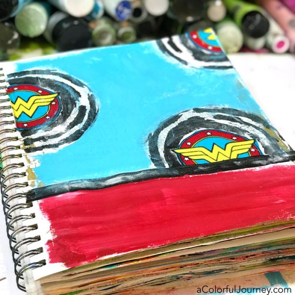
Placing the Finding Your Tribe stencil on it and using the all purpose baby wipe got rid of some of the red.
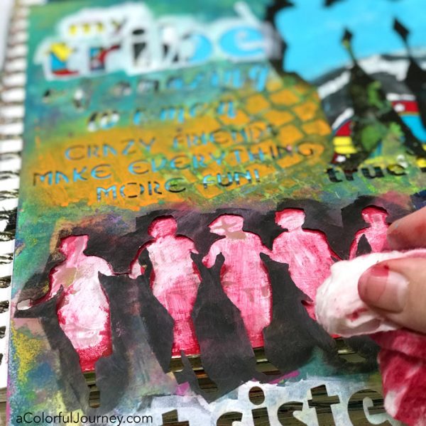
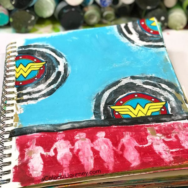
Removing some of the red allowed the pattern of the gold to peek through. That first layer of gold that I thought I didn’t like, made this so much more interesting by creating a subtle pattern. And gold of course goes with Wonder Woman.
Every art journal page needs some journaling on it to feel complete. What did I write about? I’d love to tell you it was some deep meaningful musing about the empowerment of women…but really it was all about how much I loved that movie and how I wished they had worked her invisible jet into the movie.
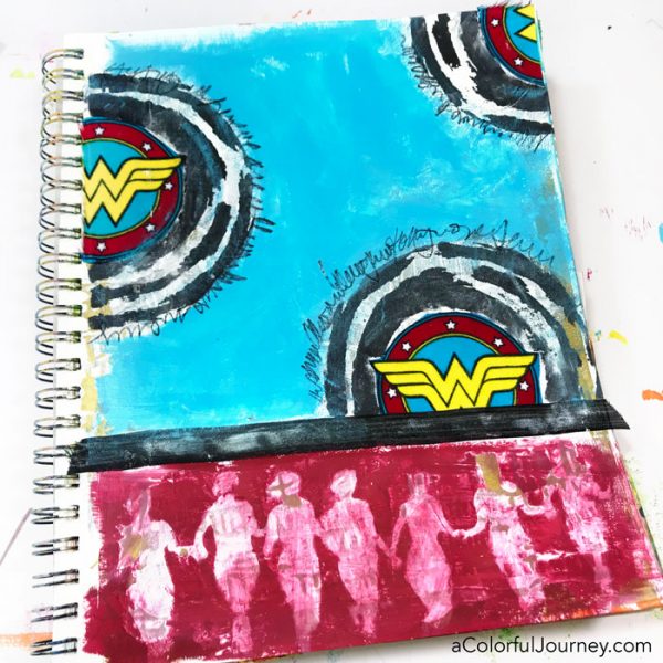

What a bright and bold page. Your rainbow stencil really brought out the wonder woman logo. And the dancing ladies shadowed that idea. xox
Carolyn! Love this Superwoman page! gorgeous. so cool how you did the tribe figures at the bottom – by removing the red and allowing the gold and white showing through from underneath. So GLAD you used red!! I’m a “red-freak” 😀 Thanks for keeping us laughing and playing!
I agree … You made a fab women-power page – definite 2 thumbs up!
I lov d that movie also and I do have a tribe of women who are the best in my world. I think I ne d to make a page for them.
Excellent blogpost, as always! I never thought about using black in a rainbowish style – that’s so cool and I want to try it now Carolyn! Thank you so much!
~Barbara Hauenstein aka Barbee
Lovely page! I like the process and the result!