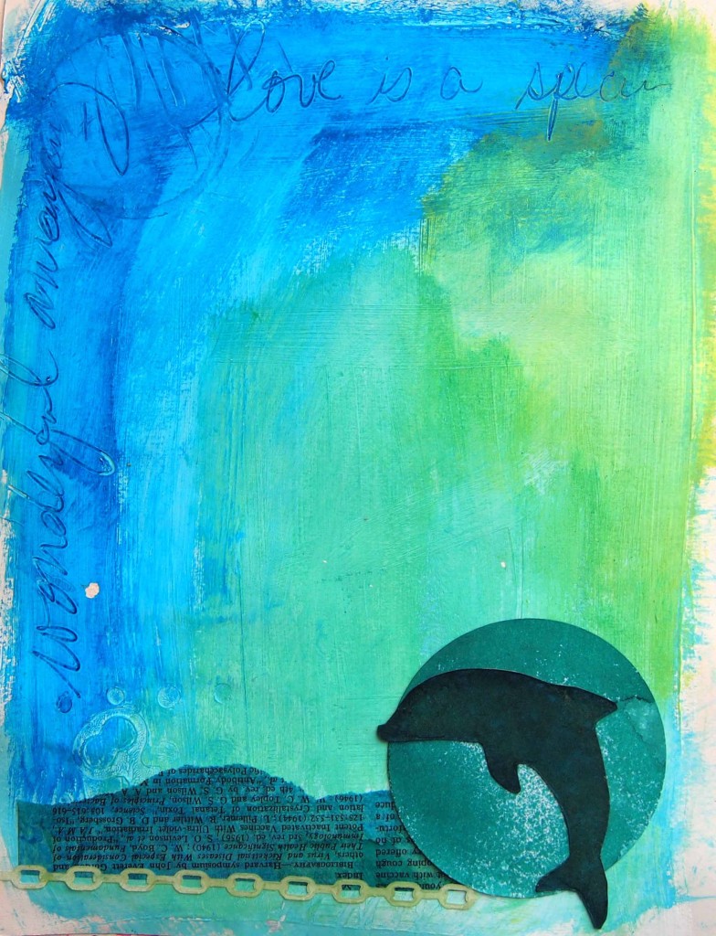
 Michelle Wards Crusade #61 is about restraining yourself- which is a challenge for me. I made this art journal page a while ago but felt conflicted. I usually fill a page with lots and lots. I like things overdone just like the king’s little chateau in Versailles. This page was different. I loved the greens and blues so much I didn’t cover up the background. I kept it, waiting patiently for the answer to reveal itself. I couldn’t consider it finished with all that blank space in the middle.
My answer is in this month’s Crusade. I have been given permission to restrain myself. This is a “quiet” journal page that reminds me of the peace of watching the waves on vacation. The blues and greens of the ocean waves are hypnotic and pure happiness. Now I consider it complete.
Thanks Michelle for all the wonderful Crusades, the inspiration, and all the wonderful people I have gotten to know from these!


Way to push yourself out of your comfort zone and come up with something gorgeous. xx
Carolyn, thank you for your kind words on the team blog 🙂 LOVE THIS PAGE! I understand the feeling we can get about wanting to add more but I’m glad you stepped away from this one. I am enjoying the breathing space, and the color mixes, and brush strokes. So much of the beauty found here might have gotten lost if you added more. I’m feeling the waves, the beach, the sunny joy…even without you narrating it on the page. In fact, I’m taking this moment to recall my many dolphin and whale watching days. Thanks for sharing your work and your perspective with the team!!
Yep, sometimes less is really more! Valerie
It’s a lovely page, very calming, congratulations.
Big love
AJ
Beautiful page. It’s very calming in the blues and greens, and I like the elegant little dolphin in the corner.
This really is beautiful and calming. I too would’ve found it hard to stop, but I think it’s just right! Thanks for sharing. I so love coming to your blog!
Very beautiful. The part about restrain yourself. I find that less is just right more often than not. In words and art. xoxo Terah
Beautiful! The top half –just the blues and greens and a few handwritten words–reminds me of a favorite sheet of scrapbooking paper that I’ve kept for years 🙂
Unique is what I say. A great bold image at the horizon line, and a lovely bluegreen sky/sea. Really calming colors and it takes me right to the beach in Cambria or Maui or any of a dozen places where I’ve found peace and contentment. Thanks for sharing!
A beautiful page. I just love the green and blue background – the atmosphere you’ve created is wonderful – it’s taken me back to my holidays and I too am watching the sea!
Hello Carlolyn, oh yes moments of bliss…those round curved glassy waves on a sunny summer’s day…beautiful! Your colours invite such thoughts….perfect to leave it like that…the imagination can then take over! Thanks for visiting over at dreamcolour and have yourself a wonderful week. xx
Absolutely lovely journal page ~ thanks for coming by ~ namaste ^_^
Hmmm…not sure why, but I couldn’t find a link to comment on your PPF post! So, I’m here to say…thank you for the delightful tutorial. Happy for you re Somerset!
Carolyn, you did a GREAT job with restraining yourself, and your journal page ended up being fantastic! The blue and greens are absolutely yummy (and give me the immediate sense of vacation too!) Love the simplicity of it. xoxo
I agree – less is sometimes more – The colours and textures of the background are lovely – great piece.
Beautiful! I love these bright serene colors and the subtle textures. It really makes the dolphin ‘pop’ and yes, I can just hear the waves lapping onto the shore.!!
Such a gorgeous blend of colors. I can see why you didn’t want to cover it! Your work is so beautiful and inspiring!
I love your page……. the colours are so beautiful. I really like your writing around the edge.
Gorgeous! Love how you have blended the blues and greens to get that marine feel.
How wonderful that you listened to that inner artist voice and then the reason for the simple, peaceful page was revealed ! Love that ! And I love the blues and greens of this soft page. Reminds me of my time at the beach.
I haven’t done a Crusade for a long time but I am so happy to be celebrating this last one with all of these taelnetd artists.
Here’s to the creative life ! Cheers !
I’ve just come back from the ocean, and looking at your page takes me right back – the beautiful colors, the sound of the water, the breeze in my face…thanks for your beautiful page…
Wow! You did restrain yourself. Very very cool, particularly the blue under the writing; it’s a gorgeous colour.
I always enjoy my “end of month, and the newspaper’s finished blog cruise ‘n comment” time. It’s been lovely to meet you and your work via the Crusades. Thanks for sharing what you do with everyone. May the rest of 2012 be filled with creative happiness for you.
I love your page. I’ve been making quite a few things with these colors. The page is peaceful and calm. Love it.
This feels so cool and aquatic! I love the text that it looks is scratched up in the margins. There is also something really neat how the background color does not reach the edge of the pages. I love it. Thanks for sharing with the team! Best wishes, tj
How beautifully blue is that? Such a calming color, and a great topic! I love it.