
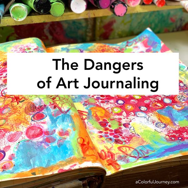
There are dangers to beware of when art journaling. You’re not in danger, actually the opposite because art play is soul nourishment and a way to release stress.
But it can rather hazardous to certain art supplies. One art supply isn’t gonna make it out of this play alive- see what happens in the video.
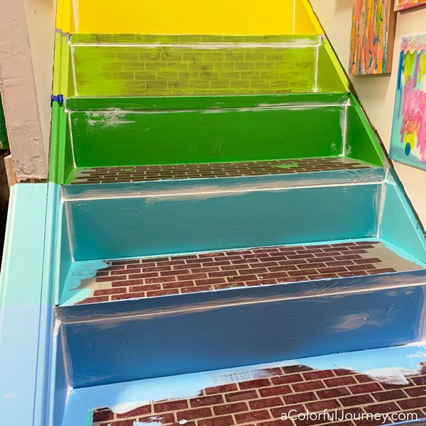
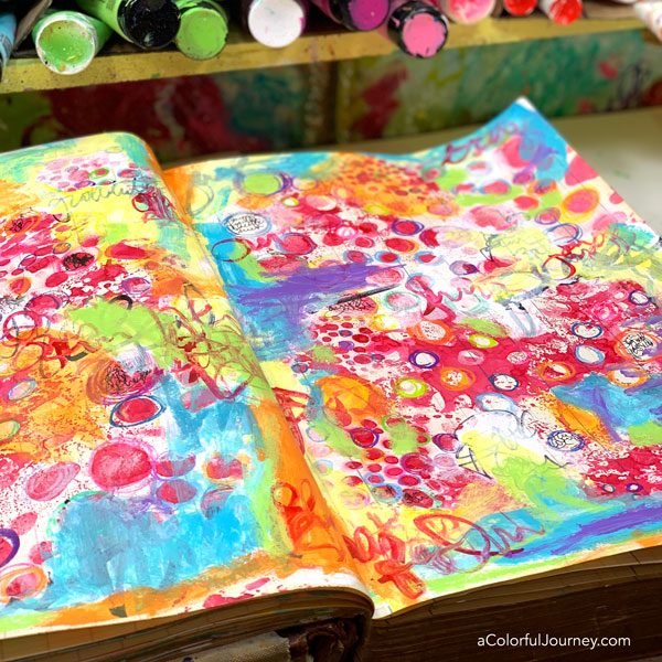
I’m playing in a giant 150 year old ledger I call MoJo.
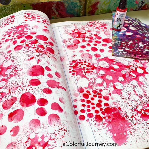
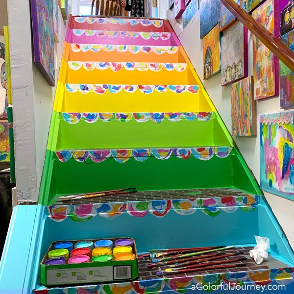
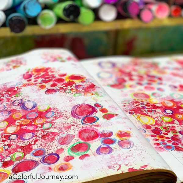
The first layer is just one stencil, Speckles and Spots, and Art Spray. The stencil has 3 different sizes of circles so it looks like I used all sorts of stencils here, but it was really just one.
Why use Art Spray for an early layer? Because it won’t bleed through the layers or reactivate when once it’s dry. That means I can put paint on top and it won’t come through.
The journal I’m working in is a 150 year ledger- you can see more about it here- so the Art Spray is taking a while to dry. There are parts that are still wet but that won’t matter with colored pencils.
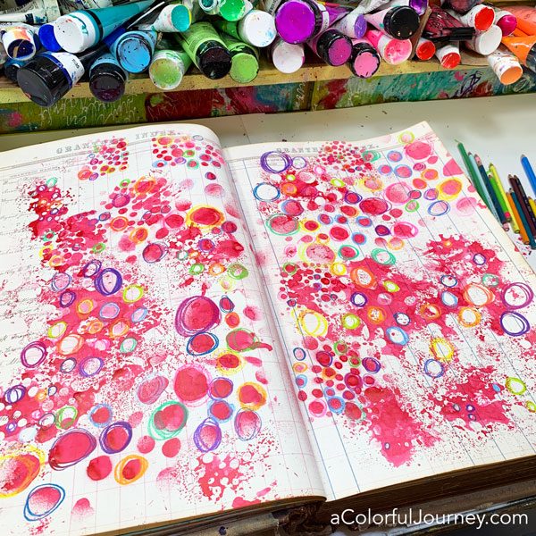
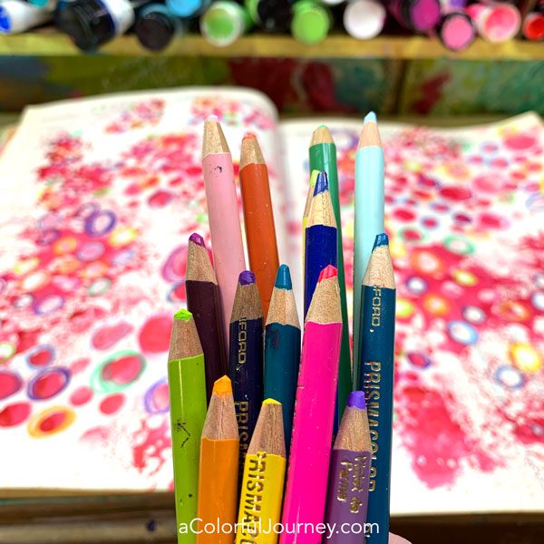
What happened when I used a colored pencil in a wet area? Nothing. It didn’t hurt the pencil and the pencil just didn’t write in that area. So it’s not the pencils that were in danger…

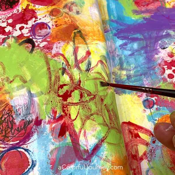
How did I choose this exact brush and why? If I’m doing a small area, I’m going to grab a small brush and if I’m doing a large area, I’m going to grab a bigger brush. There’s something even more important though than the big brush/little brush factor… which brush is clean.
All my other larger brushes were in the yucky paint water, and since I was about to use white, I needed a clean one. So, whichever brush was about the right size is the perfect one.
The white paint wasn’t dry and if your Spidey sense is tingling that there is
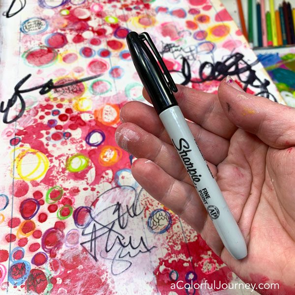
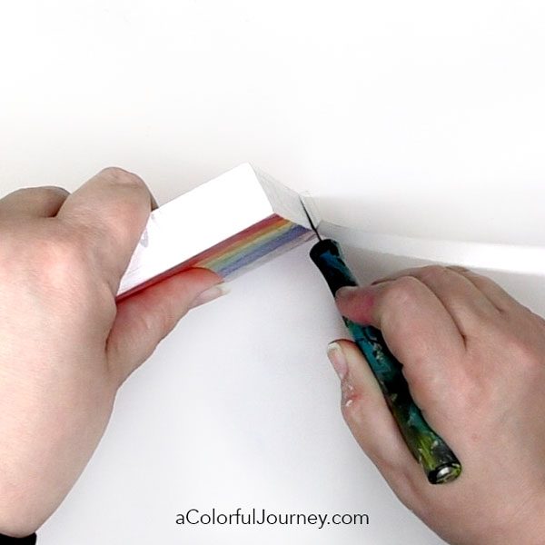
The brave and valiant Sharpie hung in there for a while, but the wet paint was just too much for it. So, that’s why I grabbed the really jumbo one. Guess you know why I buy my Sharpies in multi packs now.
Along with all the paint and Art Spray, oil pastels were added in some spots. Yes, oil pastels on top of acrylic paint.
When adding a fluid something on top of oil pastels, it beads up and creates a different look. I love that and do it on purpose. As I brushed on some of the Art Spray over the oil pastel, you can see how it beaded up.
You’re not supposed to do that but I do it anyway. After all, this is play and not brain surgery. It’s about having fun using art supplies!
If you want to feel that freedom of play then I encourage you to check out my free online workshop called Permission to Play. In there I’ve got downloadable goodies for you and specific strategies, things that you can do to let loose to really get into the play and just have fun making and creating.
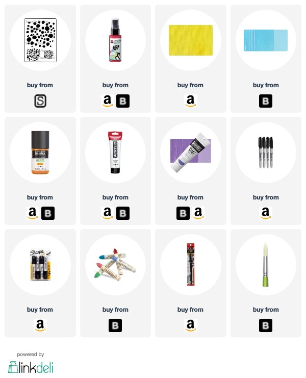
Here are the supplies used. Some of these links are affiliate links which means I get a small percentage. It doesn’t cost you anything extra and it helps keep the free tutorials coming!