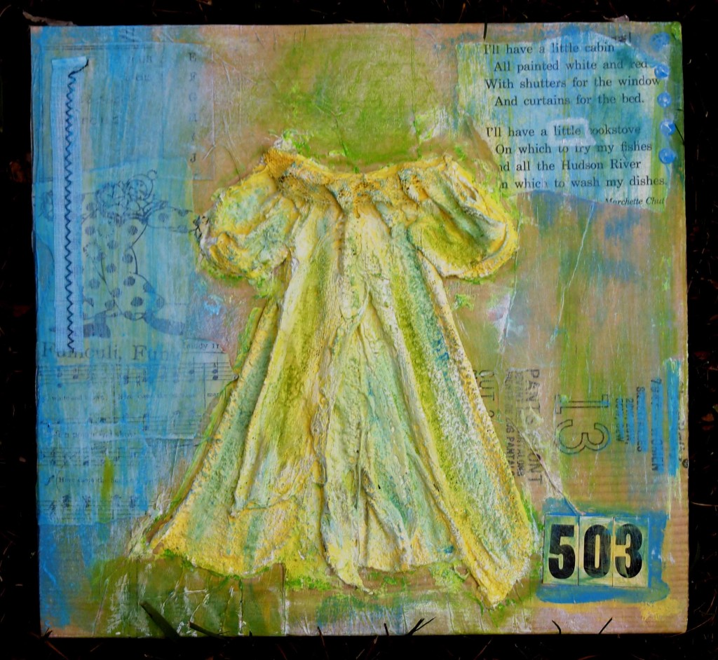
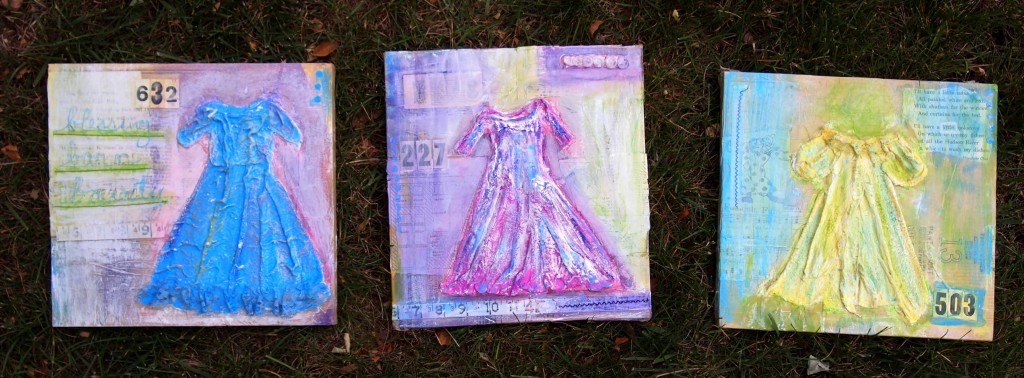
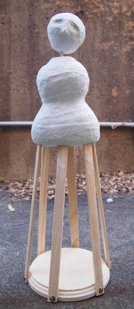
We started with the plaster and made the dresses.
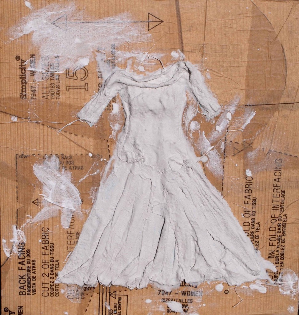
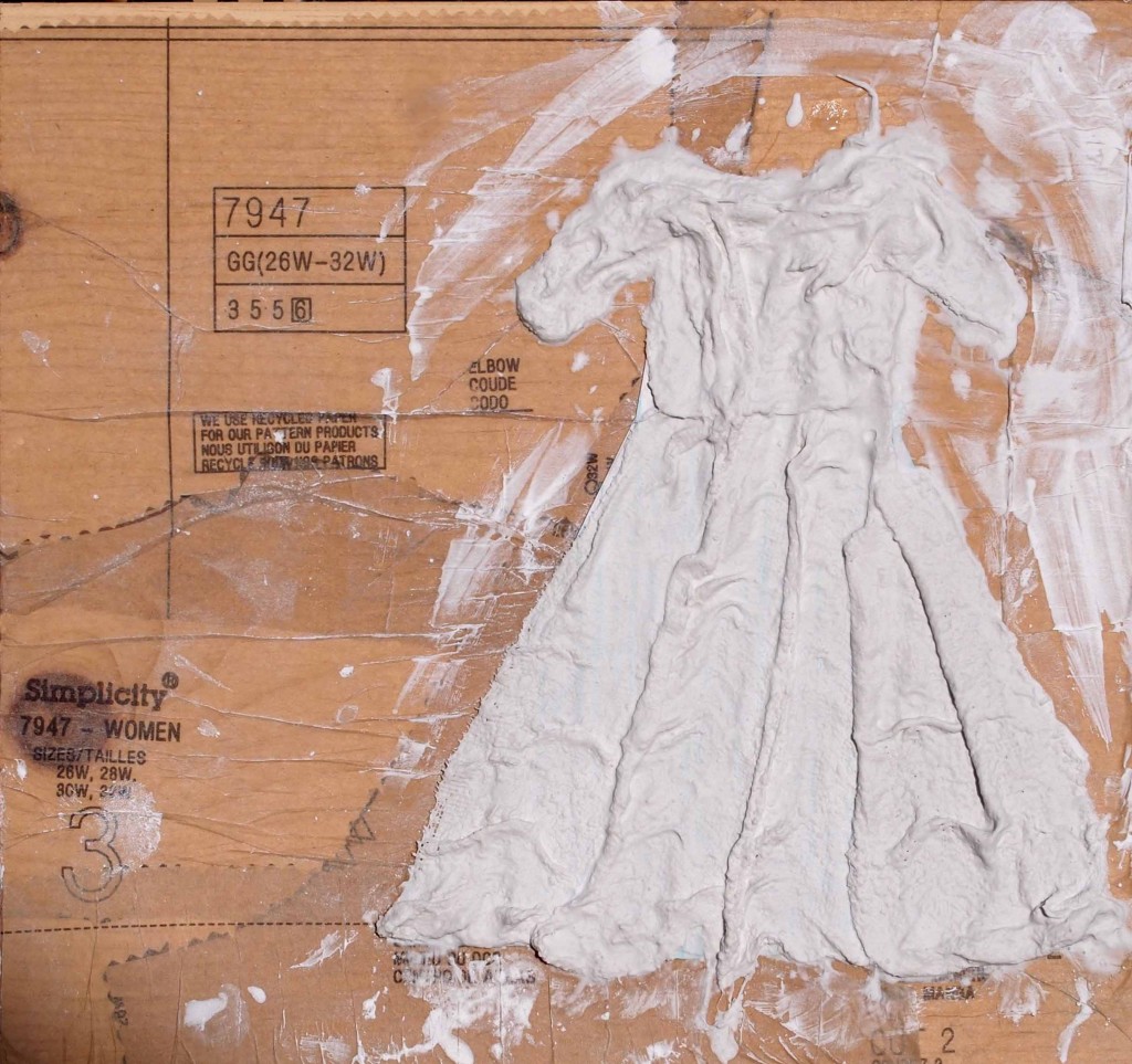
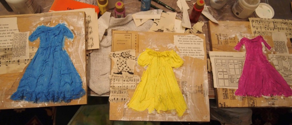 This is where the dresses are now. I have more to add, but that will have to be at a later time.
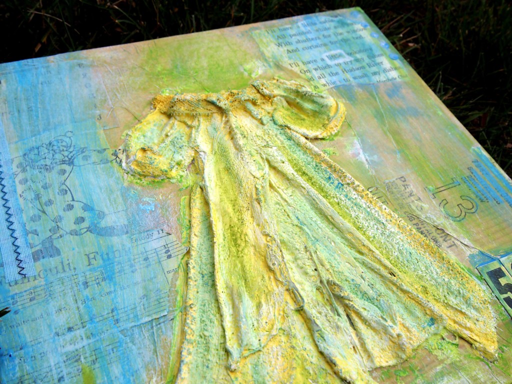
  Here’s a closer look at the texture. The dimension just makes me happy!

We started with the plaster and made the dresses.


 This is where the dresses are now. I have more to add, but that will have to be at a later time.
  Here’s a closer look at the texture. The dimension just makes me happy!
Doll making is something I haven’t explored until Art Is You. Dee Foust was a wonderful teacher who took me way past my comfort zone and I have a wonderful angel.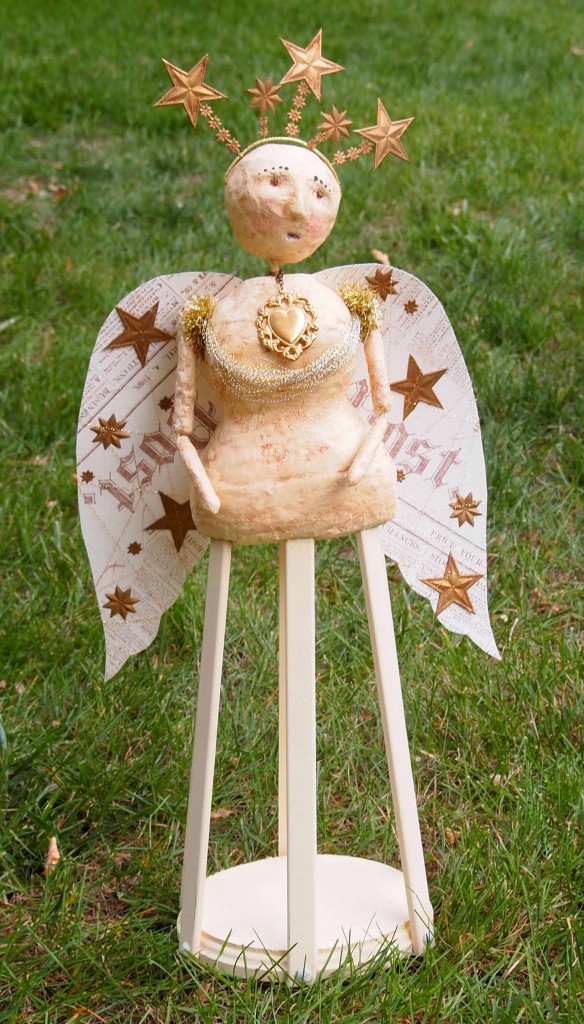
Life lesson 6,592 – don’t give up. I was skeptical while sculpting the torso of my angel since I don’t think of myself as a sculptor. Why? Because I’ve never done it. I didn’t see where it was going but I didn’t let my inner critic get in my way. This green floral foam is so soft it cut easily. Instead of using sand paper I used my palms to sand it smooth. At this point I just had to trust that it would “look right”.
This was the 2nd class this week that used plaster gauze. I have loved it each time I used it. I think this means it is time to procure some! Why was I so intimidated by sculptural things? Not any more.
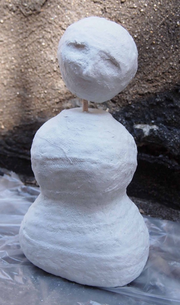
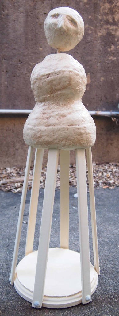
 The cream paint and subtle brown antiquing began to bring it to life for me. Okay, just made it close enough to the finished product that I didn’t feel as much anxiety.
I recently went to Louisville to see the artist Peter Max give a presentation and perhaps buy a piece of his work. When I arrived I found out he was there the day before and I didn’t know about the change. Turned out I was going to see Nano Lopez. I’d never heard of him but his work and his presentation drew me in…
What I learned when I saw Nano’s presentation and sculpture:
1. bronze is very, very, very heavy
2. his art has so many layers of objects and textures that it draws you in (textures and objeccts from nature to trinkets from WalMart)
3. the story behind a piece add interest and wonder (like the cauliflower that was used to make the sheep)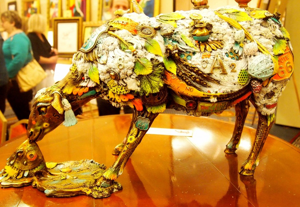
5. I don’t think I will ever be casting bronze
6. I really wanted to buy the winged horse (Hint Hint Santa)